United Airlines
Year
2012 – present
Sector
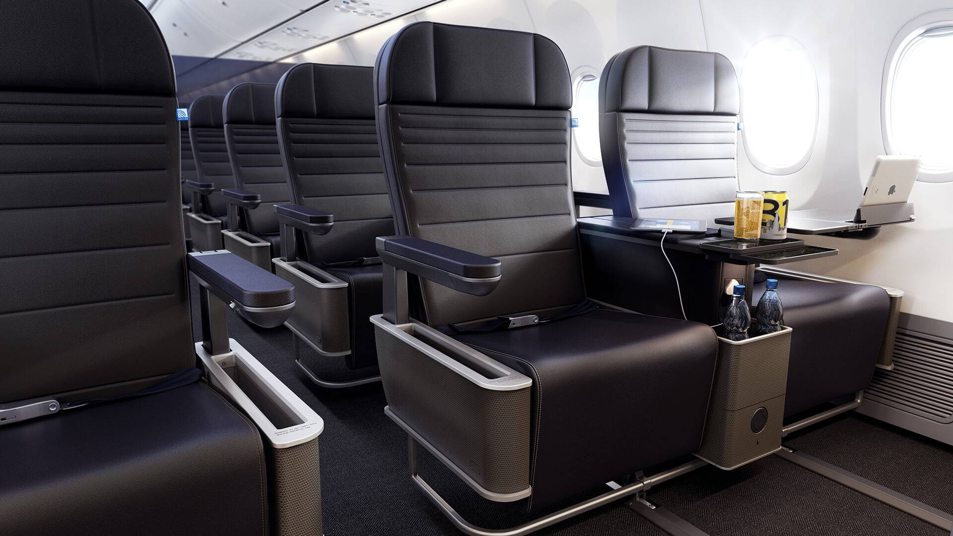
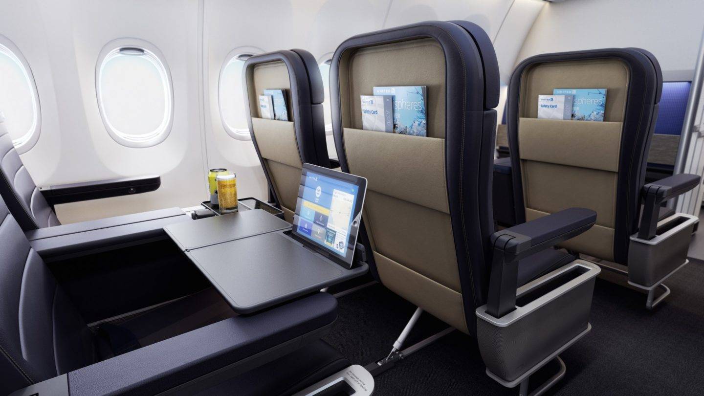
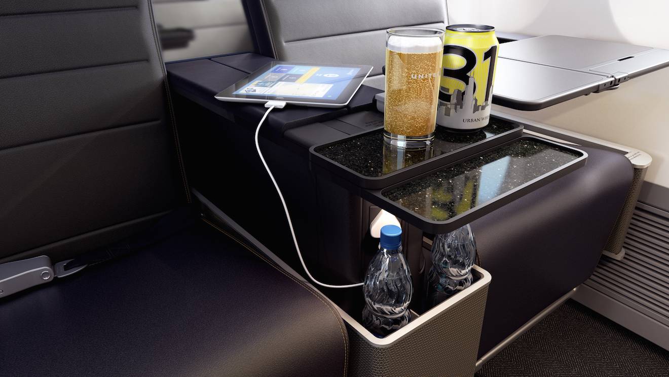
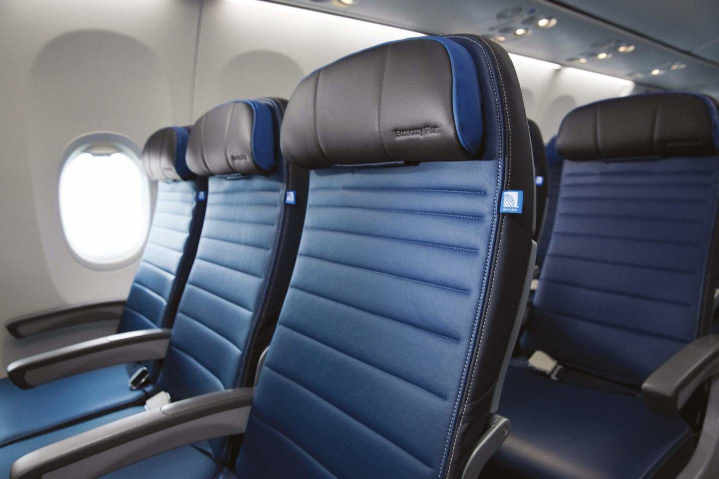
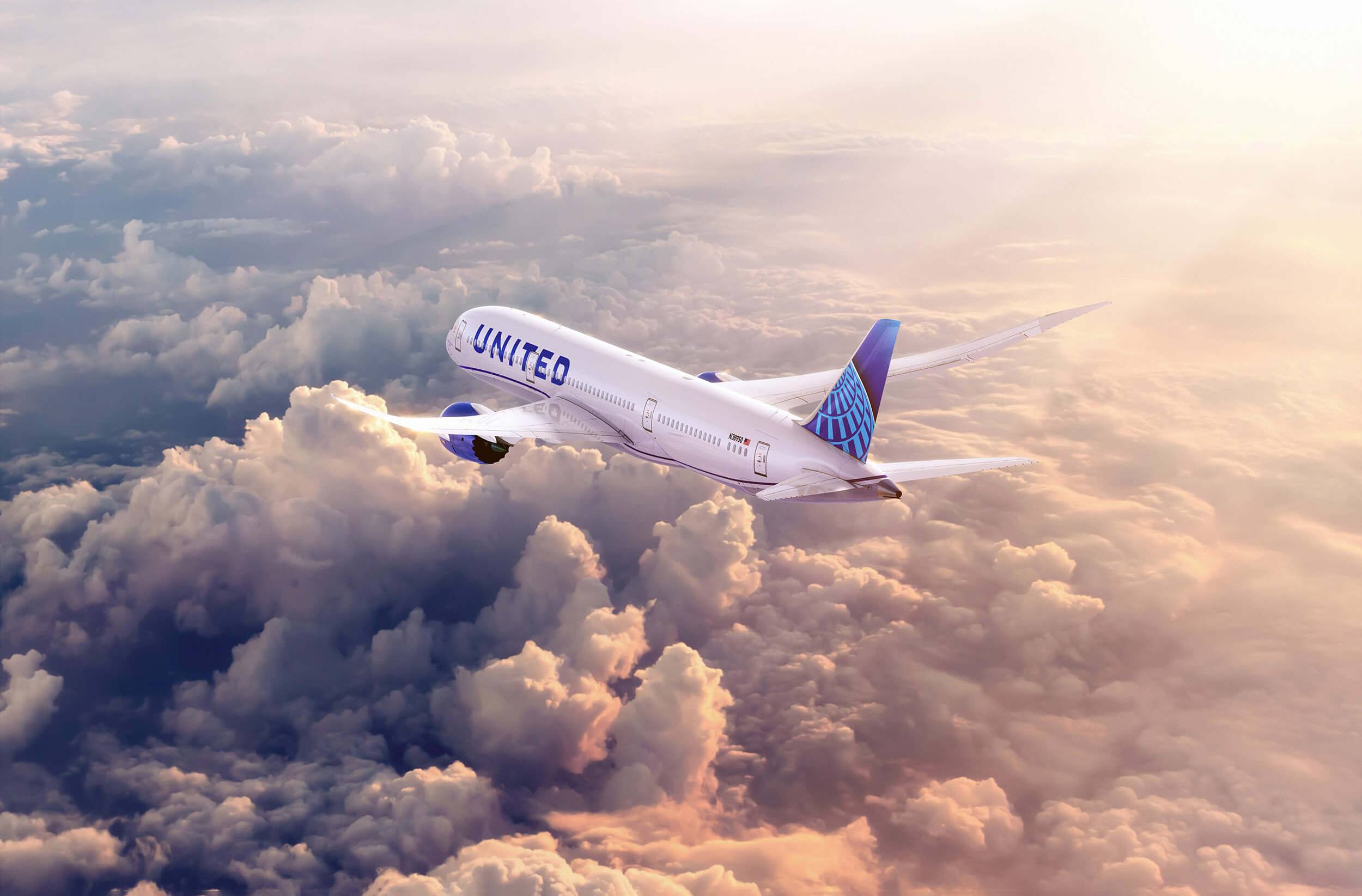
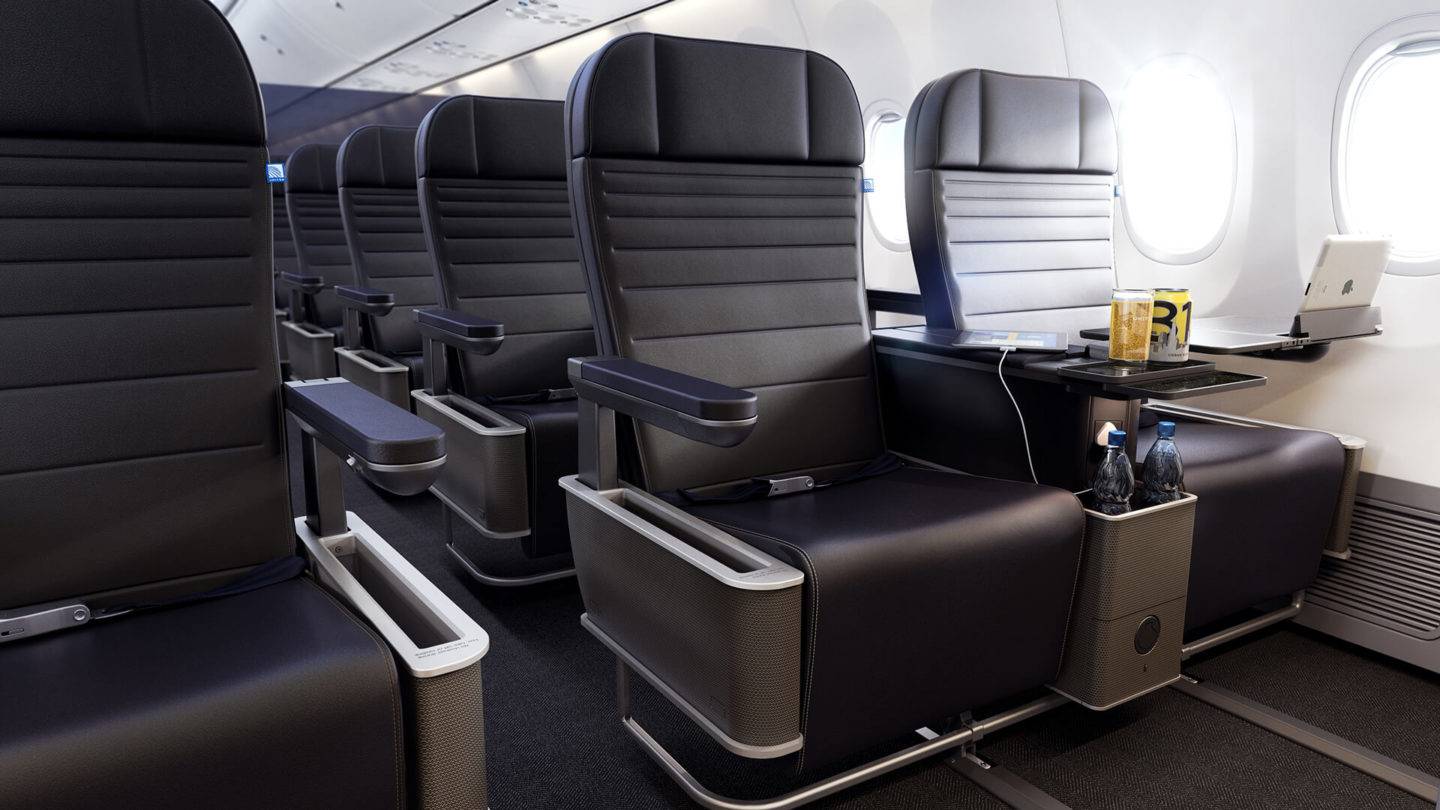
Our design partnership with United began in 2012 soon after United Airlines and Continental Airlines merged to become the world’s biggest carrier. In that time, our collaboration has spanned everything from brand identity to cabin interiors, lounge design, wayfinding, onboard products and services, and CGI visualisation for marketing and promotional materials.


Challenge
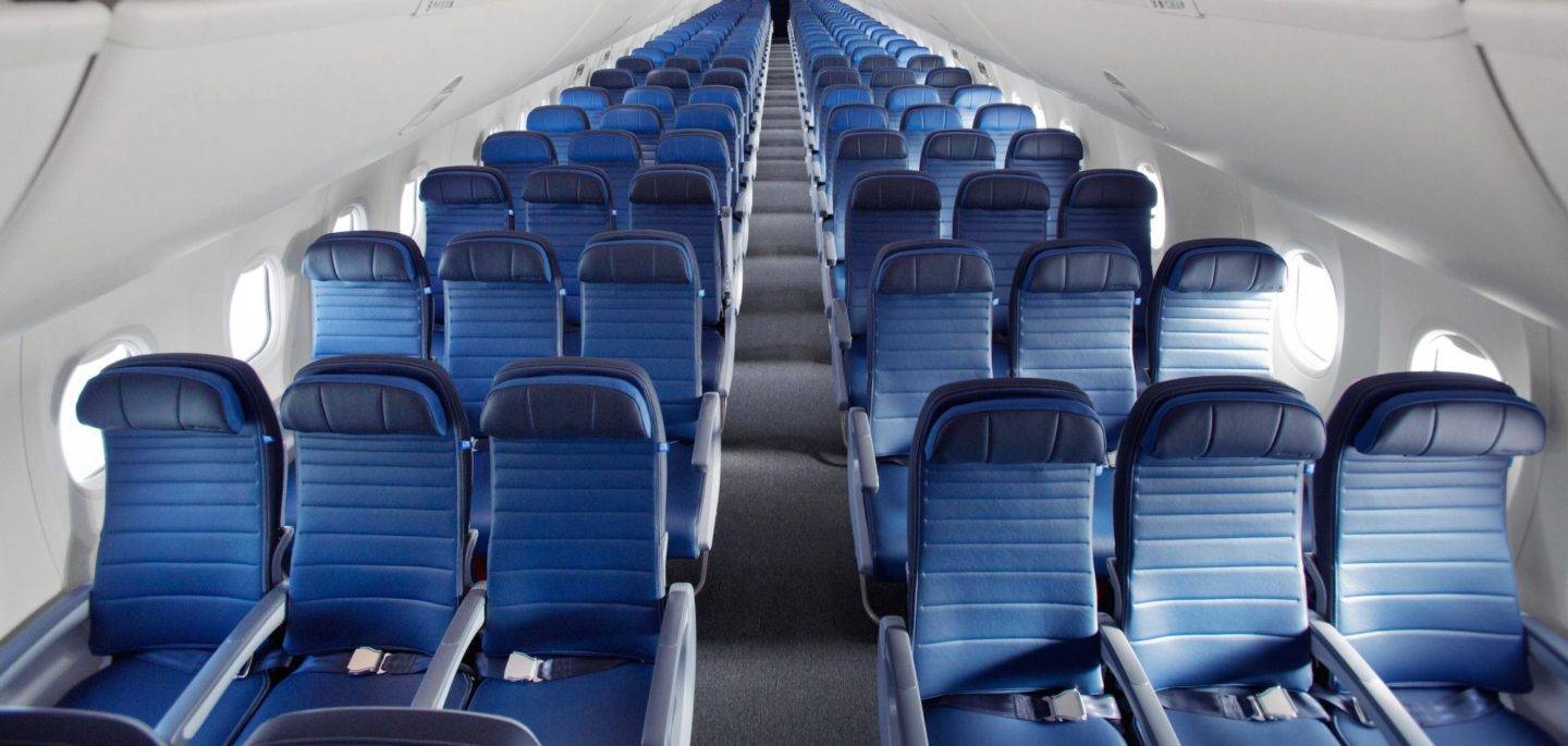
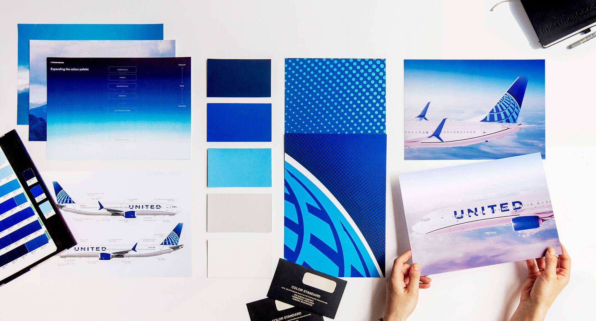
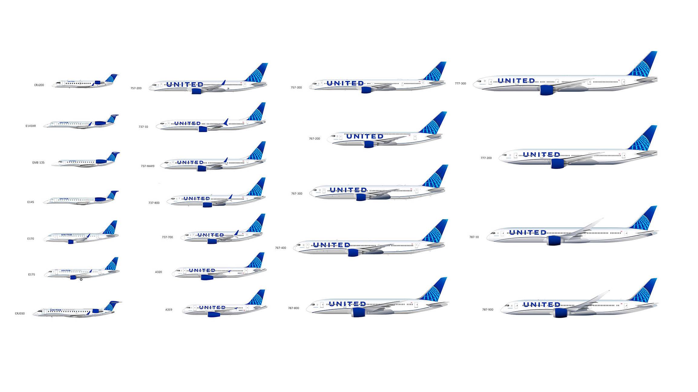
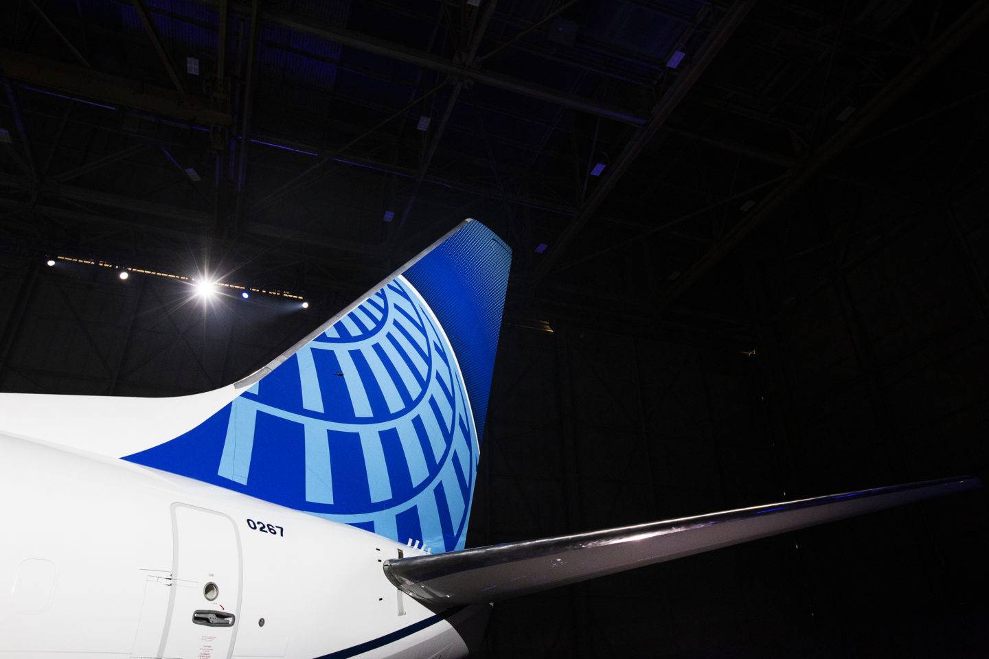
Initially briefed to create new cabin interiors for the airline’s domestic fleet, our work with United expanded to include every element of the brand identity and customer experience, from corporate brand guidelines to livery design for a fleet of nearly 1400 aircraft, cabin interiors, ground services and marketing materials, all with the goal of developing a single vision to unite the fleet across all classes and all touchpoints.
At the heart of this project has been a stepped approach that has enabled us to gradually roll-out the new designs across United’s entire business. This has helped us achieve a more holistic brand experience over time and enabled the airline to maximise return on investment.
Solution
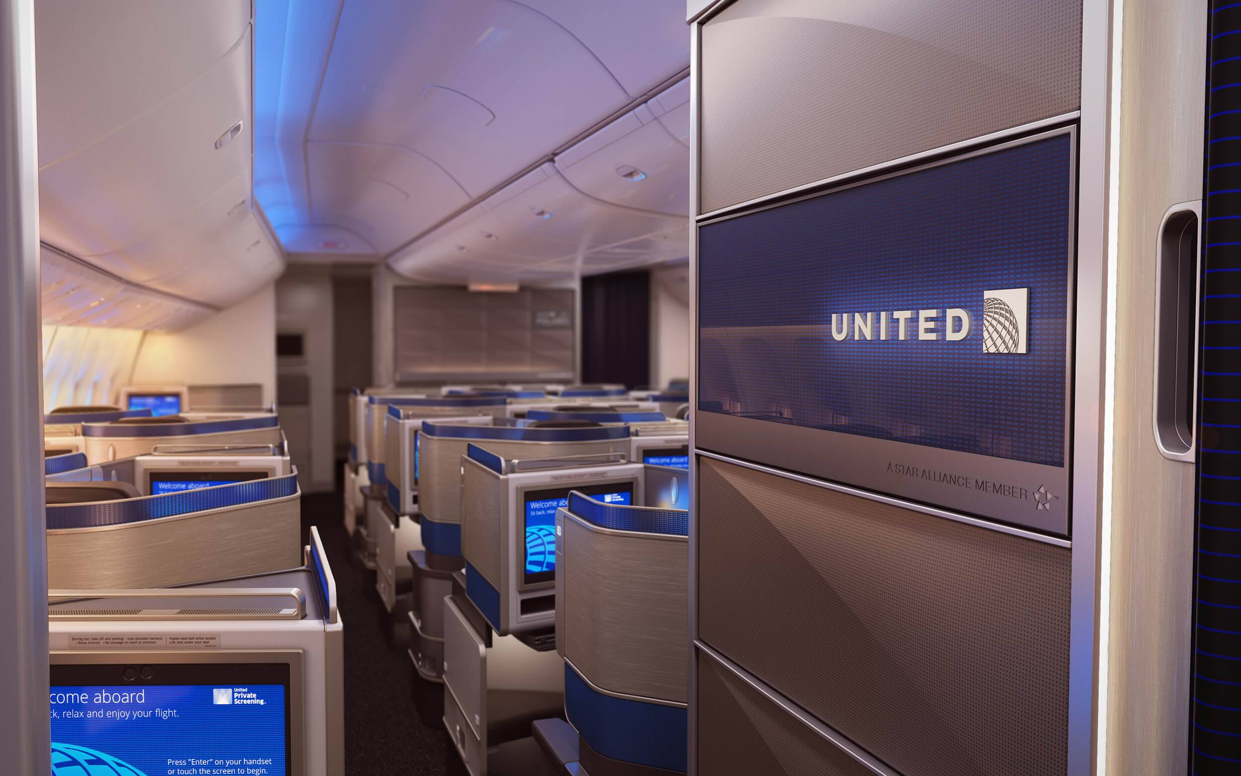
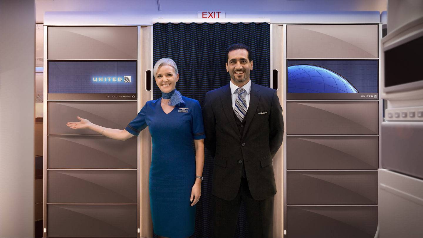
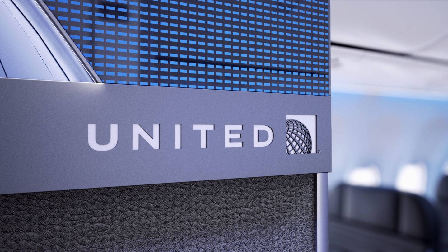
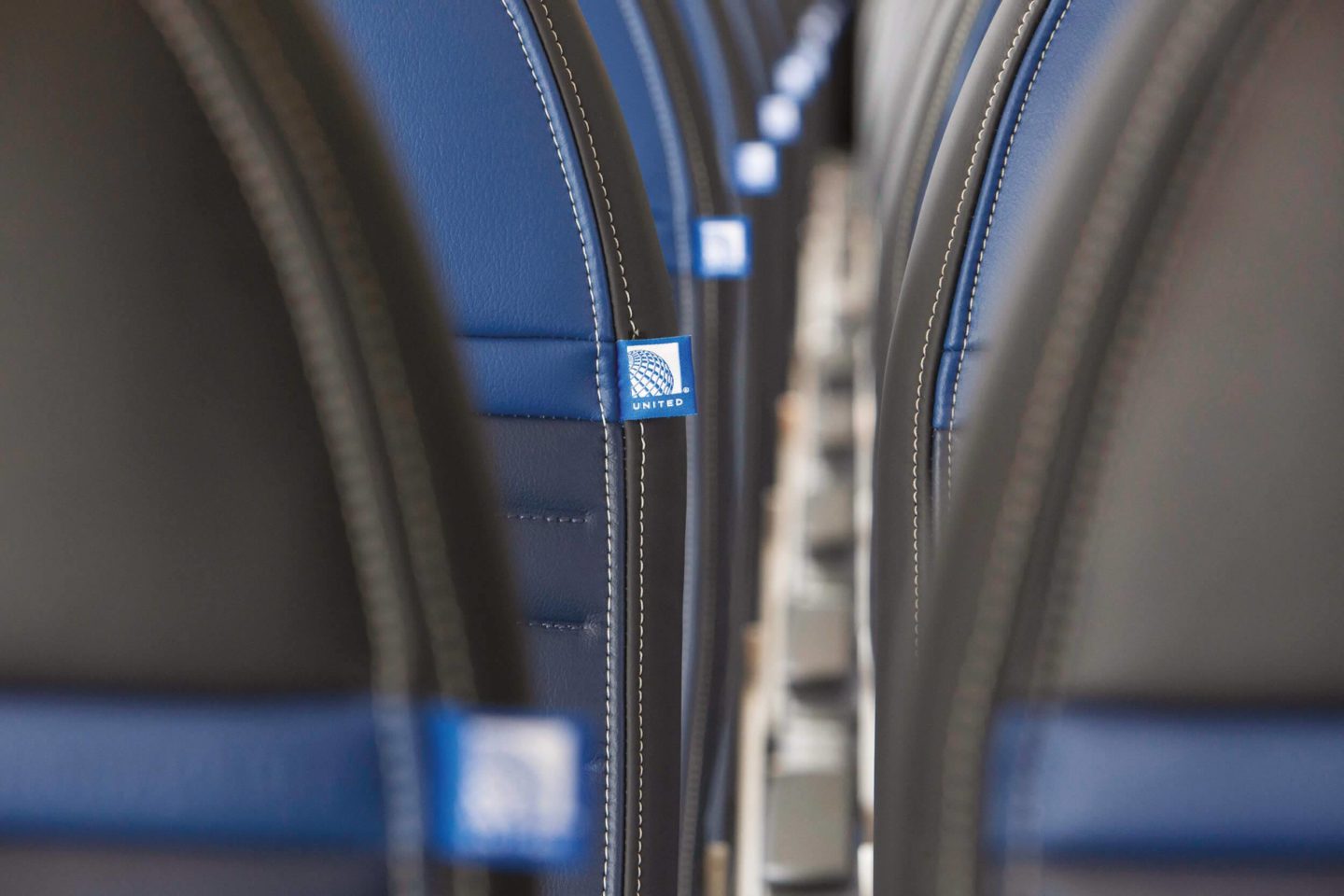
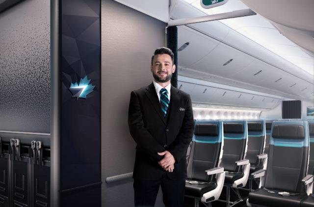
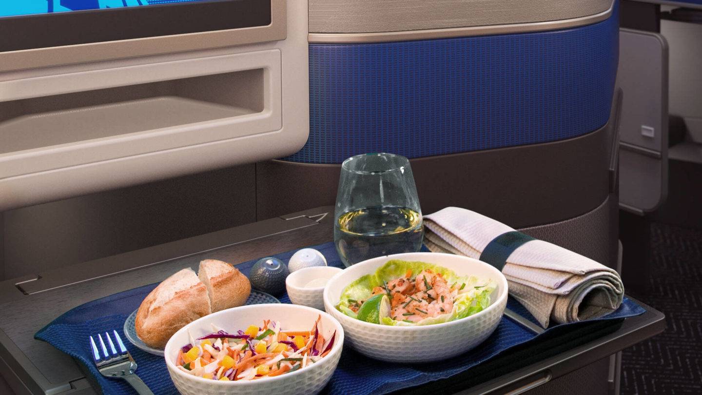
At the core of all our work with United is a clearly defined brand identity that we have used as an anchoring visual cue to create an intuitive customer journey from home to destination. We have used the brand’s globe logo as our starting point to create a wide range of designs for application across all areas of the passenger experience, from abstract patterns on brand panels onboard to textiles in airport lounges all the way to the smallest details on the inflight meal service.
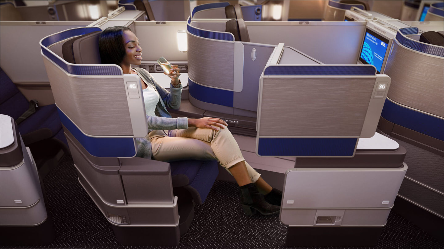
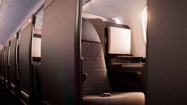
These new iconic brand elements sit alongside an extensive range of new products, like the airline’s Polaris Business Class seat, as well as everything from lounge seating to complete cabin interiors. Every touchpoint now embodies the airline’s brand DNA.
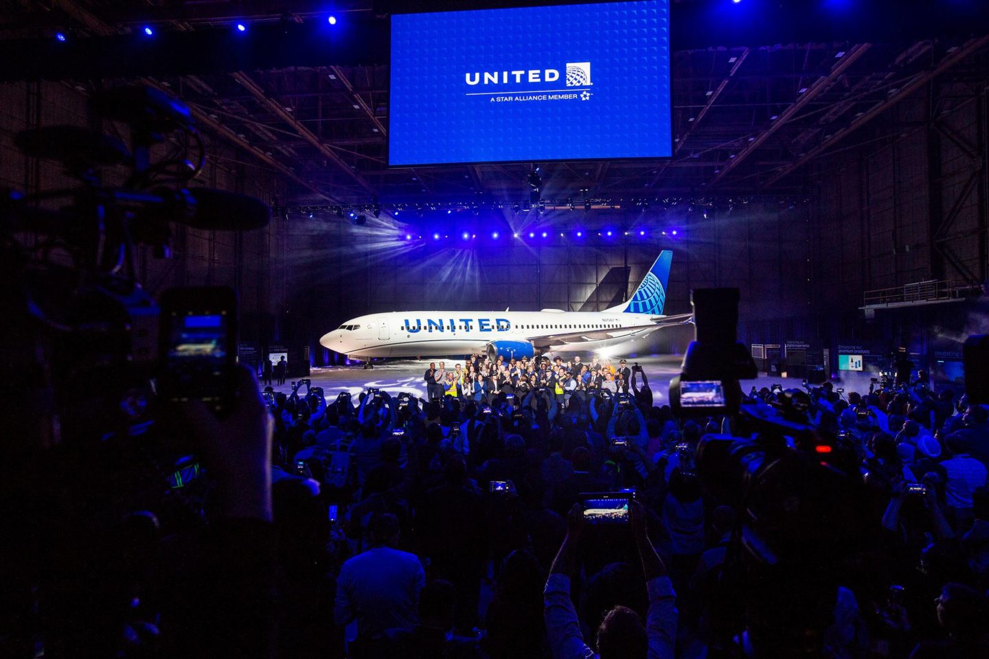
“This modernised design, especially our iconic globe, enhances the very best of United’s image and values while pointing in the direction of where we intend to go next in serving our customers.”
Oscar Munoz, Executive Chairman and former CEO, United Airlines, 2019
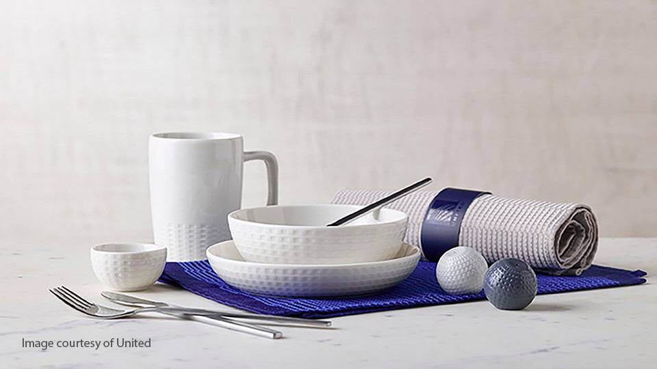
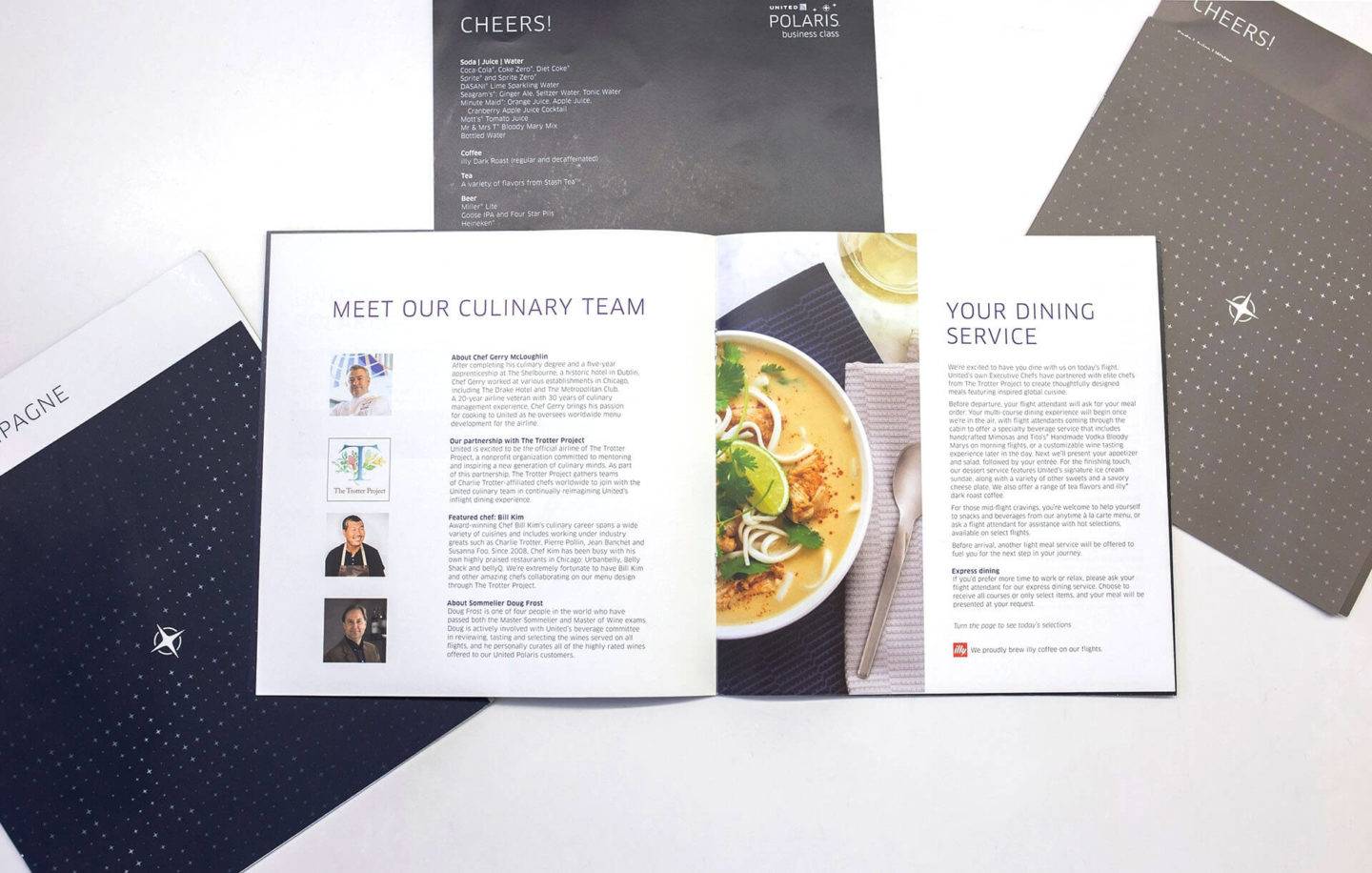
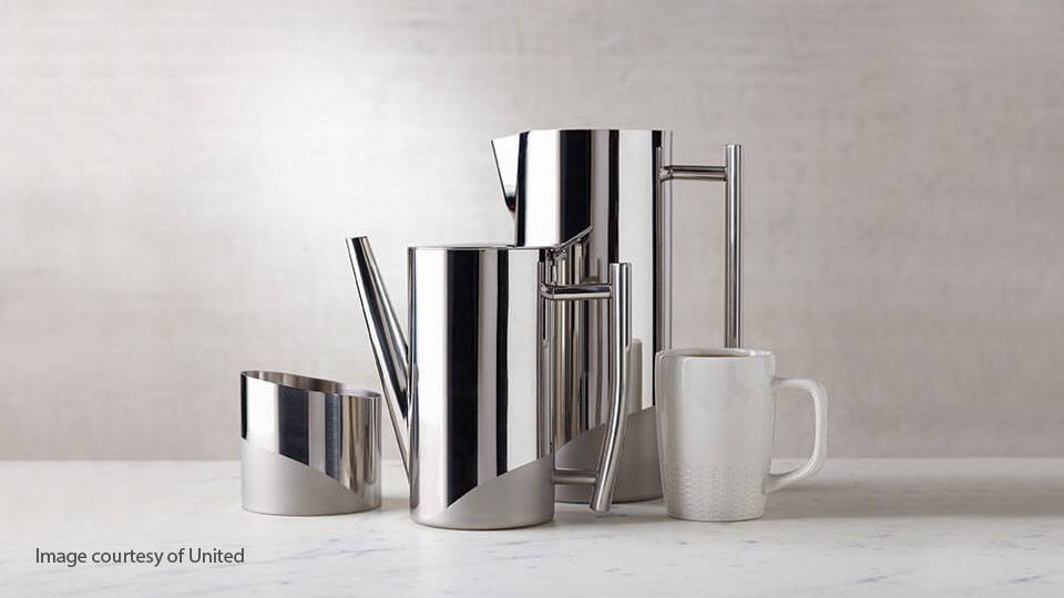
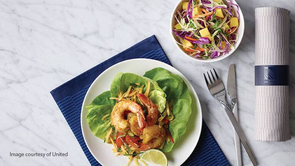
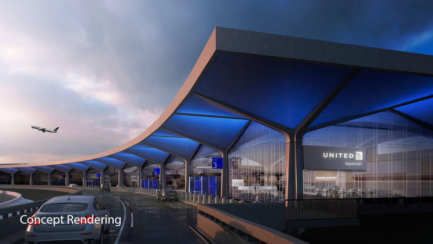
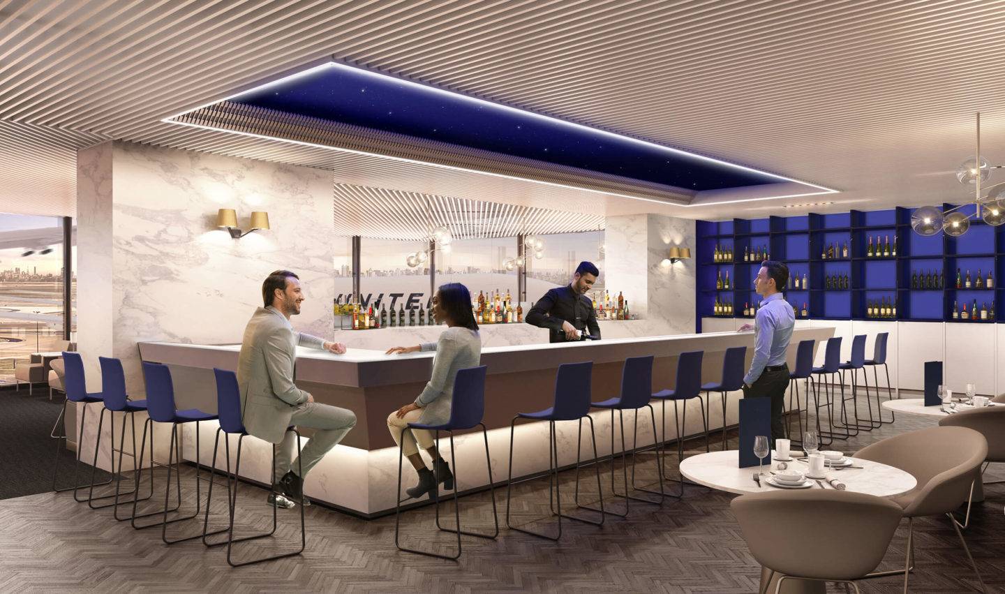
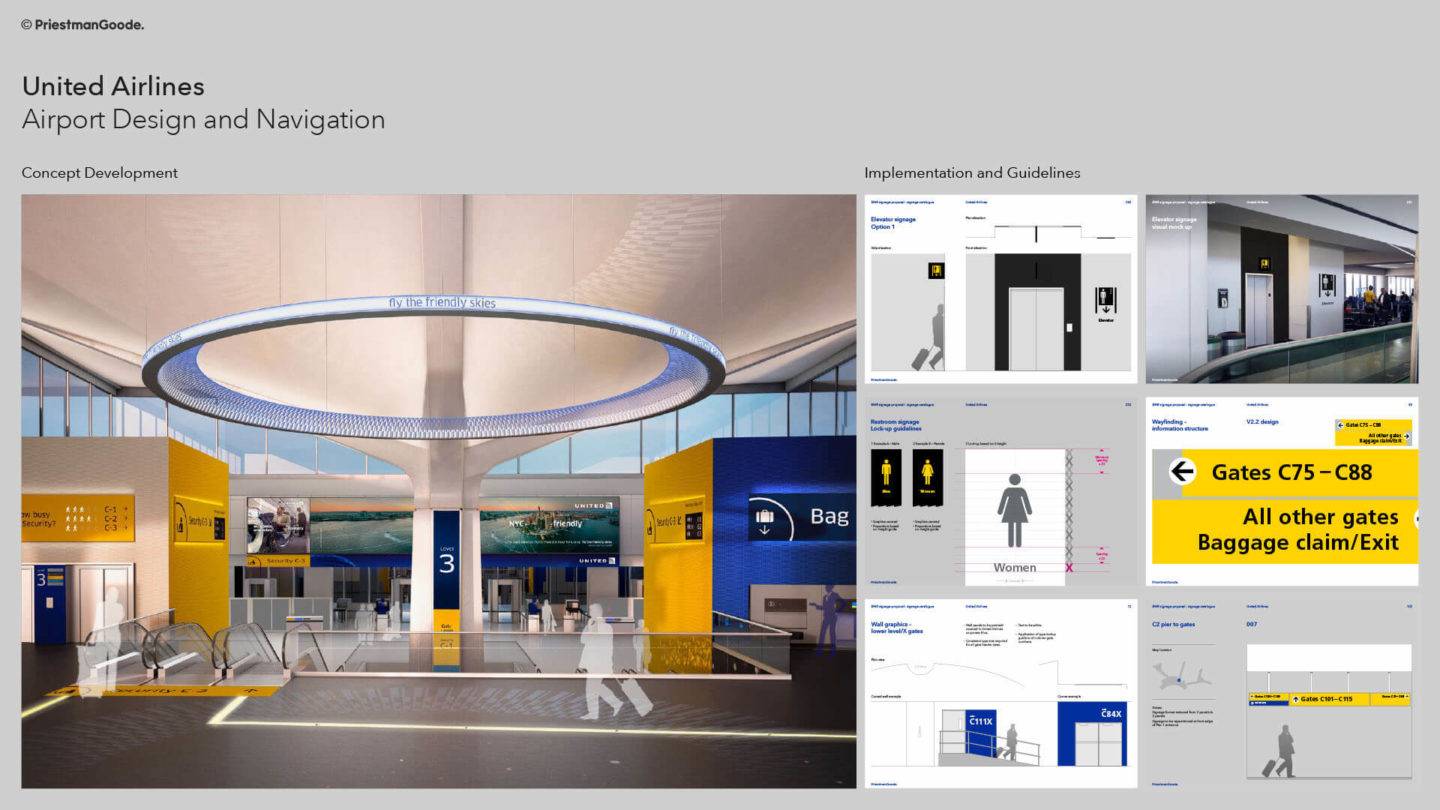
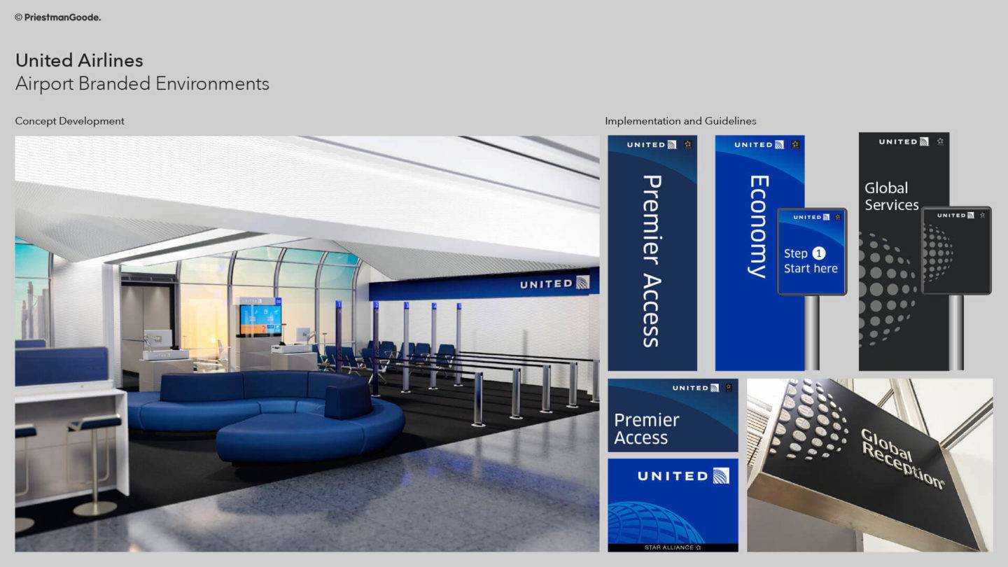
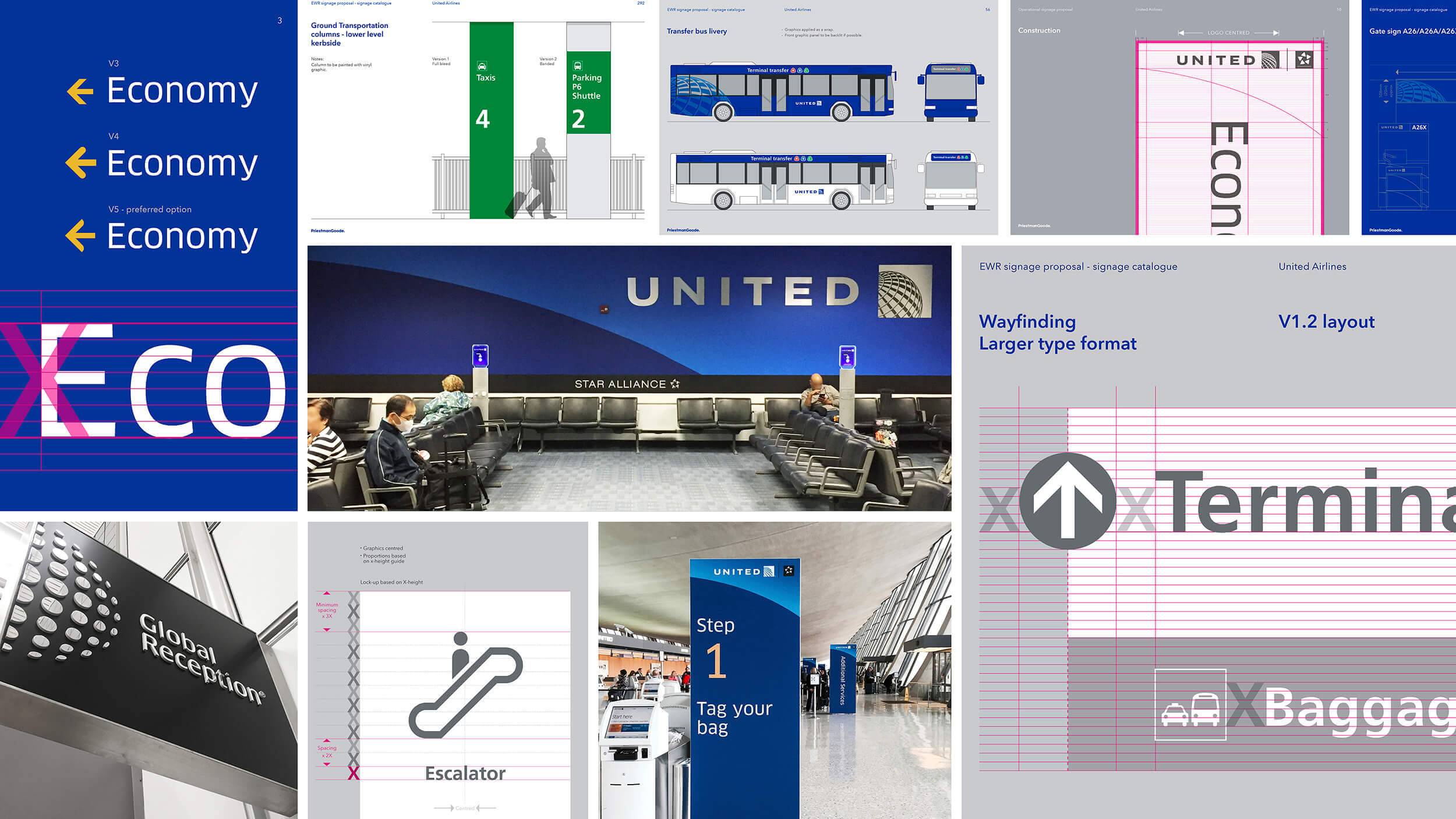
On the ground, the United experience is defined around key principles that set the tone for the passenger journey: an impactful entrance using bespoke patterns and finishes, improved passenger flow with thoughtful wayfinding throughout the airport from curbside to gate, a world glass reception with lounge design that carries forward the identity of the cabin interiors, improved personal space and brand consistency at gate.
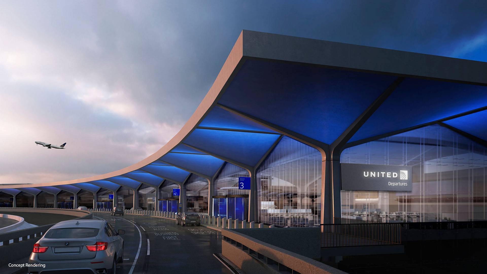
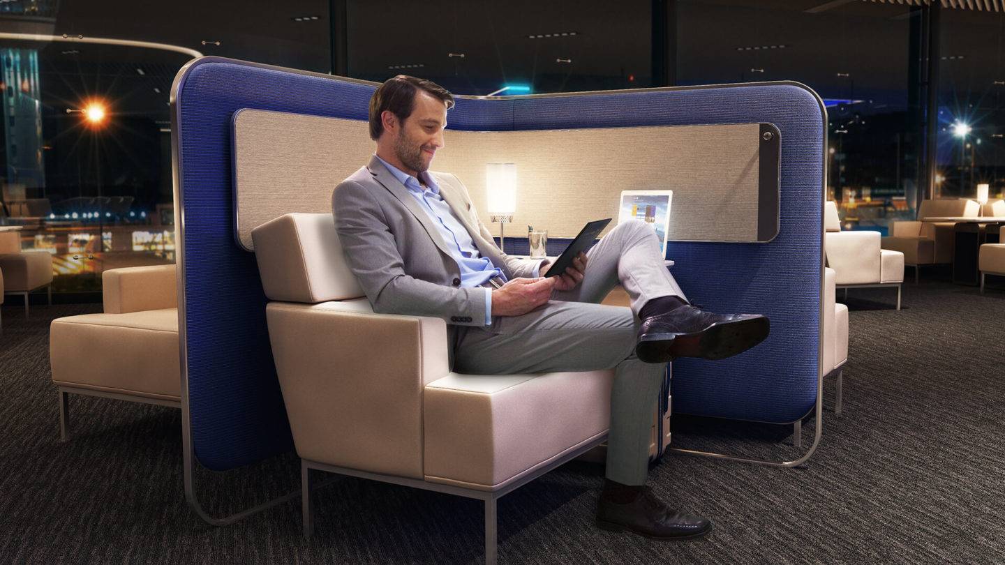
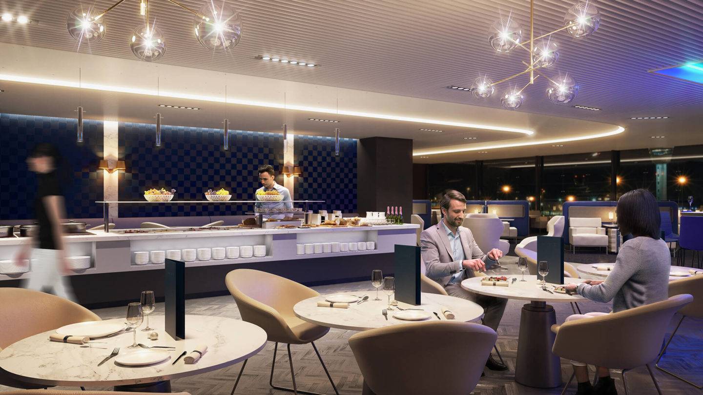
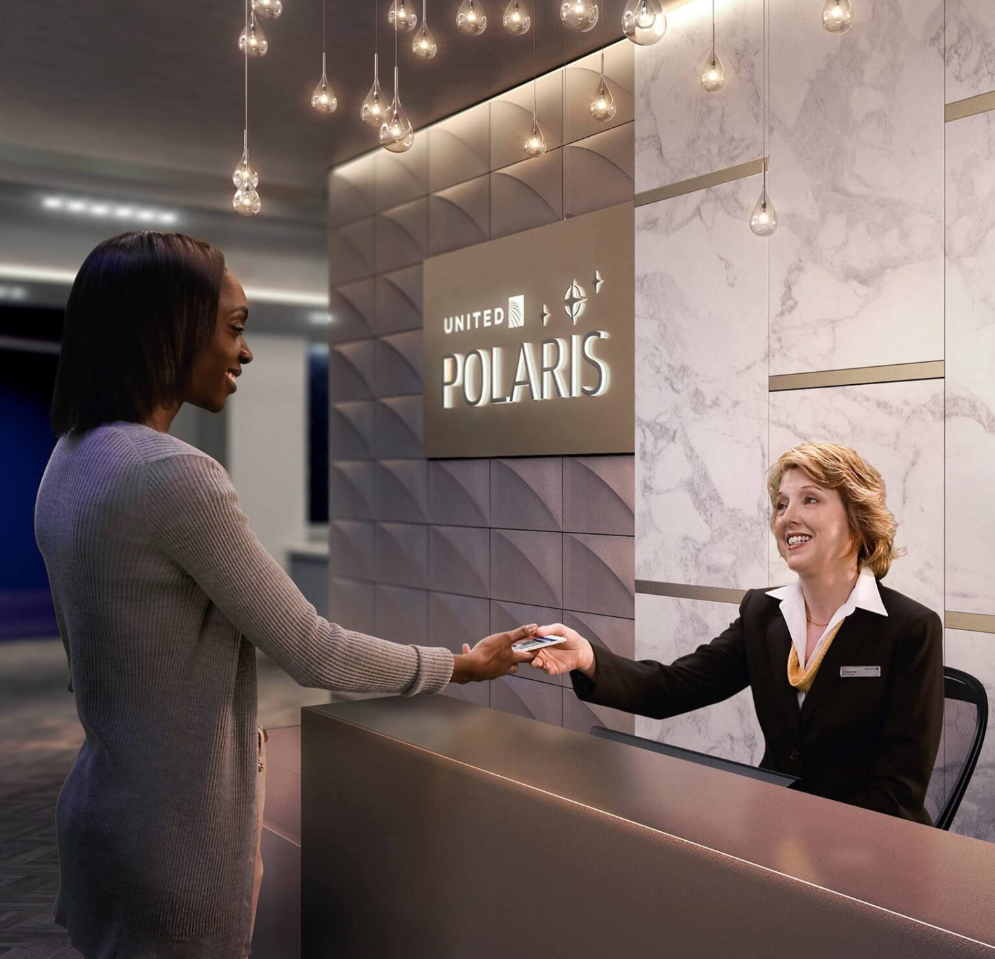
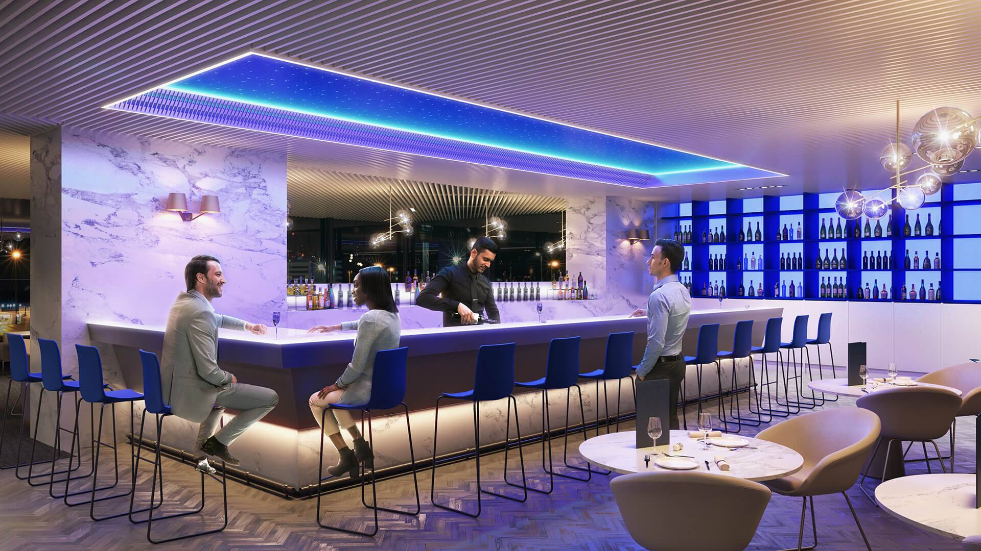
Our ongoing work with United is based on a detailed analysis of every touchpoint, both from a passenger and from airline staff’s point of view. We have used a range of tools from journey mapping to user testing and virtual reality to ensure that every experience, from digital interaction to economy and Premium, is well-thought out, beautifully delivered and clearly United.
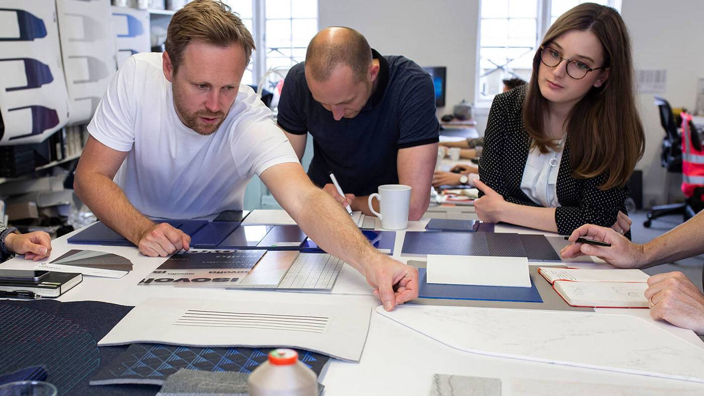
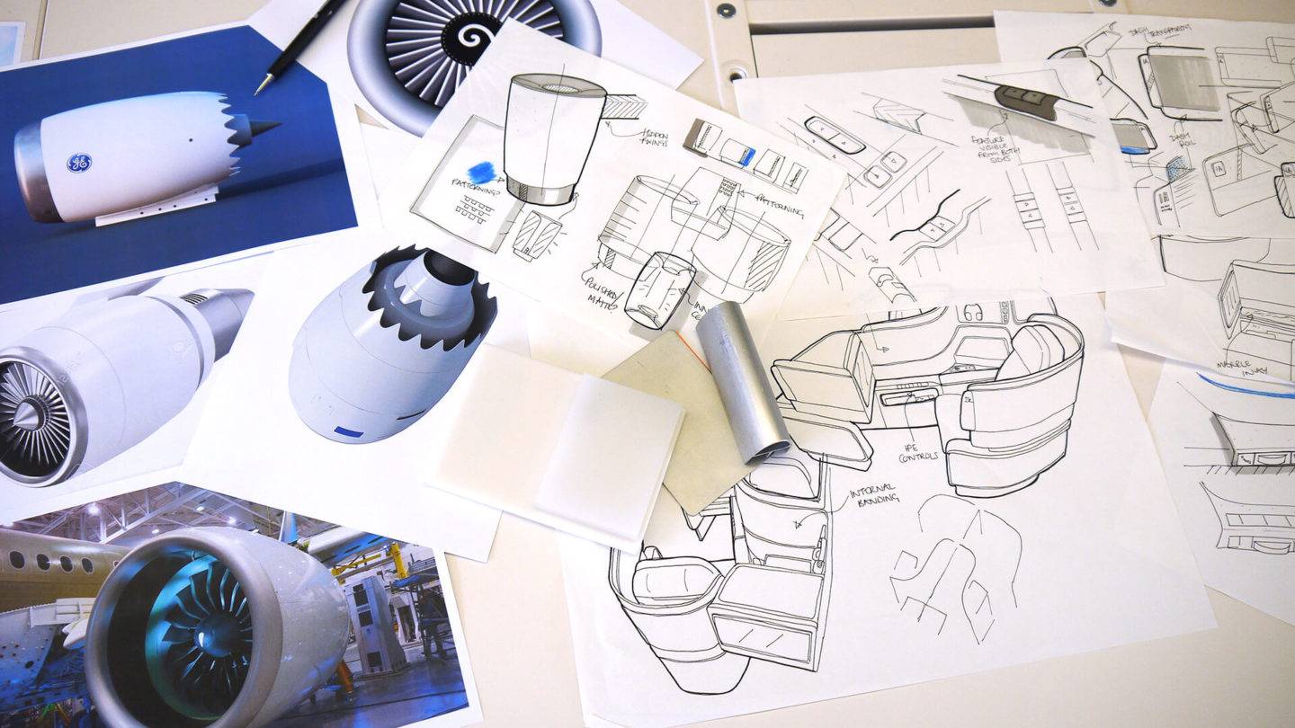
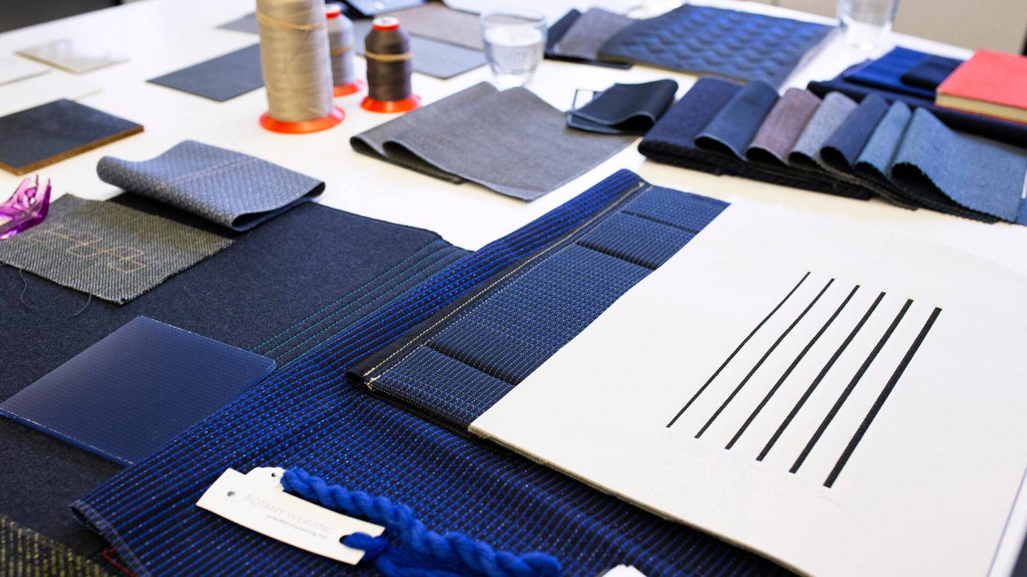
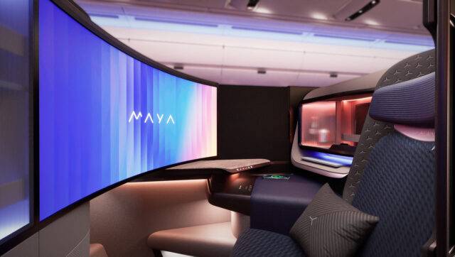
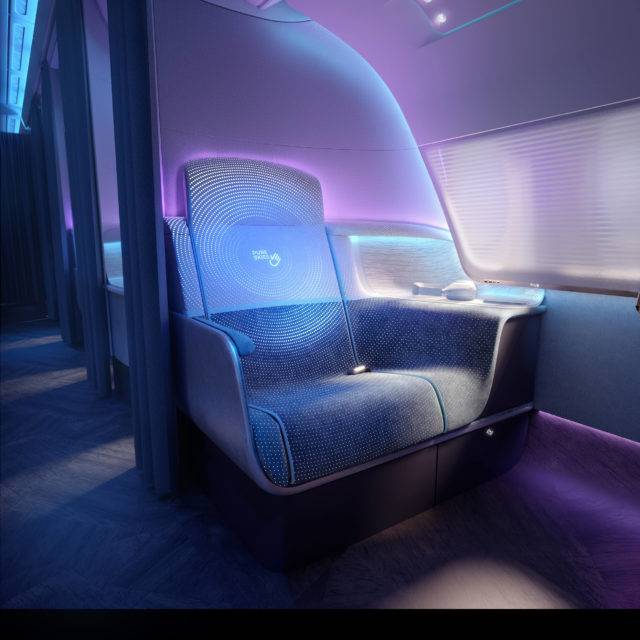
Meanwhile our CGI + Visualisation team has worked extensively over the course of our partnership, to maximise the use of visualisation and VR as part of the design and development process, as well as to create imagery and animations for marketing and promotional purposes, bringing the passenger journey to life and setting the tone for the airline’s vision to be the leading US carrier.
